AI Agent Component Spec
AI Agent Component Spec
Where It Fits
CometChatGroups is a directory list widget. It renders available groups and emits the selected Group via onItemTap. Wire it to CometChatMessageHeader, CometChatMessageList, and CometChatMessageComposer to build a group chat layout.
- Dart
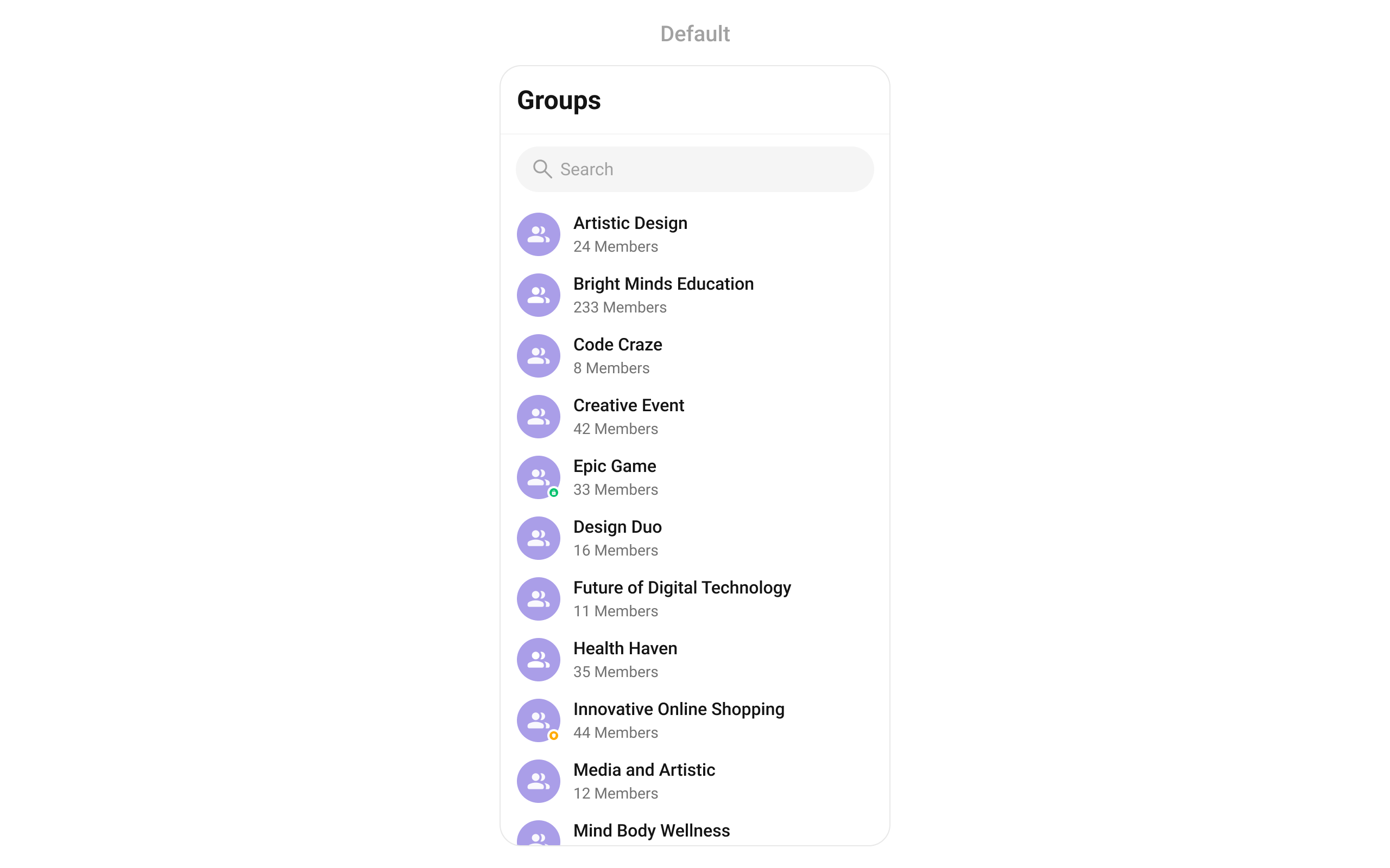
Minimal Render
- Dart
Navigator.push:
Filtering Groups
Pass aGroupsRequestBuilder to groupsRequestBuilder. Pass the builder instance — not the result of .build().
- Dart
Filter Recipes
| Recipe | Code |
|---|---|
| Joined groups only | GroupsRequestBuilder()..joinedOnly = true |
| Limit to 10 per page | GroupsRequestBuilder()..limit = 10 |
| Search by keyword | GroupsRequestBuilder()..searchKeyword = "design" |
| Filter by tags | GroupsRequestBuilder()..tags = ["vip"] |
| With tags data | GroupsRequestBuilder()..withTags = true |
GroupsRequestBuilder Properties
| Property | Description | Code |
|---|---|---|
limit | Number of groups to fetch per request. | ..limit = 30 |
searchKeyword | Search groups by name. | ..searchKeyword = "Team" |
joinedOnly | Fetch only joined groups. Default false. | ..joinedOnly = true |
tags | Filter groups by specific tags. | ..tags = ["vip"] |
withTags | Include tags in the Group object. Default false. | ..withTags = true |
build() | Builds and returns a GroupsRequest object. | .build() |
Actions and Events
Callback Props
onItemTap
Fires when a group row is tapped. Primary navigation hook — set the active group and render the message view.- Dart
onItemLongPress
Fires when a group row is long-pressed. Useful for showing context menus or custom actions.- Dart
onSelection
Fires when groups are selected in multi-select mode. RequiresselectionMode to be set.
- Dart
onError
Fires on internal errors (network failure, auth issue, SDK exception).- Dart
onBack
Fires when the back button is pressed.- Dart
onLoad
Fires when the group list is successfully loaded.- Dart
onEmpty
Fires when the group list is empty.- Dart
Global UI Events
CometChatGroupEvents emits events subscribable from anywhere in the application. Add a listener in initState and remove it in dispose.
| Event | Fires when | Payload |
|---|---|---|
ccGroupCreated | A new group is created | Group |
ccGroupDeleted | A group is deleted | Group |
ccGroupLeft | A user leaves a group | Action, User, Group |
ccGroupMemberJoined | A user joins a group | User, Group |
ccGroupMemberAdded | Members are added to a group | List<Action>, List<User>, Group, User |
ccGroupMemberKicked | A member is kicked | Action, User, User, Group |
ccGroupMemberBanned | A member is banned | Action, User, User, Group |
ccGroupMemberUnbanned | A member is unbanned | Action, User, User, Group |
ccGroupMemberScopeChanged | A member’s scope changes | Action, User, String, String, Group |
ccOwnershipChanged | Group ownership is transferred | Group, GroupMember |
- Dart
SDK Events (Real-Time, Automatic)
The component listens to these SDK events internally. No manual attachment needed unless additional side effects are required.| SDK Listener | Internal behavior |
|---|---|
onGroupMemberJoined | Updates member count, sets hasJoined if current user joined |
onGroupMemberLeft | Updates member count |
onMemberAddedToGroup | Updates member count, adds group to list if current user was added |
onGroupMemberKicked | Updates member count |
onGroupMemberBanned | Updates member count |
onGroupMemberScopeChanged | Updates member scope |
Custom View Slots
Each slot replaces a section of the default UI. Slots that accept a group parameter receive theGroup object for that row.
| Slot | Signature | Replaces |
|---|---|---|
listItemView | Widget Function(Group) | Entire list item row |
leadingView | Widget? Function(BuildContext, Group) | Avatar / left section |
titleView | Widget? Function(BuildContext, Group) | Name / title text |
subtitleView | Widget? Function(BuildContext, Group) | Member count subtitle |
trailingView | Widget? Function(BuildContext, Group) | Right section |
loadingStateView | WidgetBuilder | Loading spinner |
emptyStateView | WidgetBuilder | Empty state |
errorStateView | WidgetBuilder | Error state |
setOptions | List<CometChatOption>? Function(Group, Controller, BuildContext) | Context menu actions (replaces default) |
addOptions | List<CometChatOption>? Function(Group, Controller, BuildContext) | Context menu actions (adds to default) |
appBarOptions | List<Widget> Function(BuildContext) | App bar action widgets |
listItemView
Replace the entire list item row.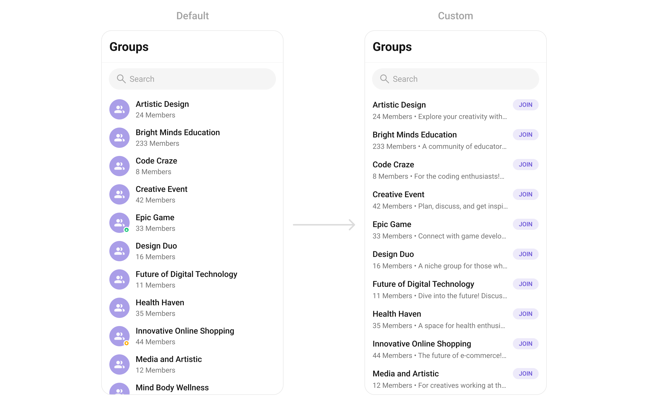
- Dart
leadingView
Replace the avatar / left section. Joined status badge example.- Dart
titleView
Replace the name / title text. Group type badge inline example.- Dart
subtitleView
Replace the member count subtitle text.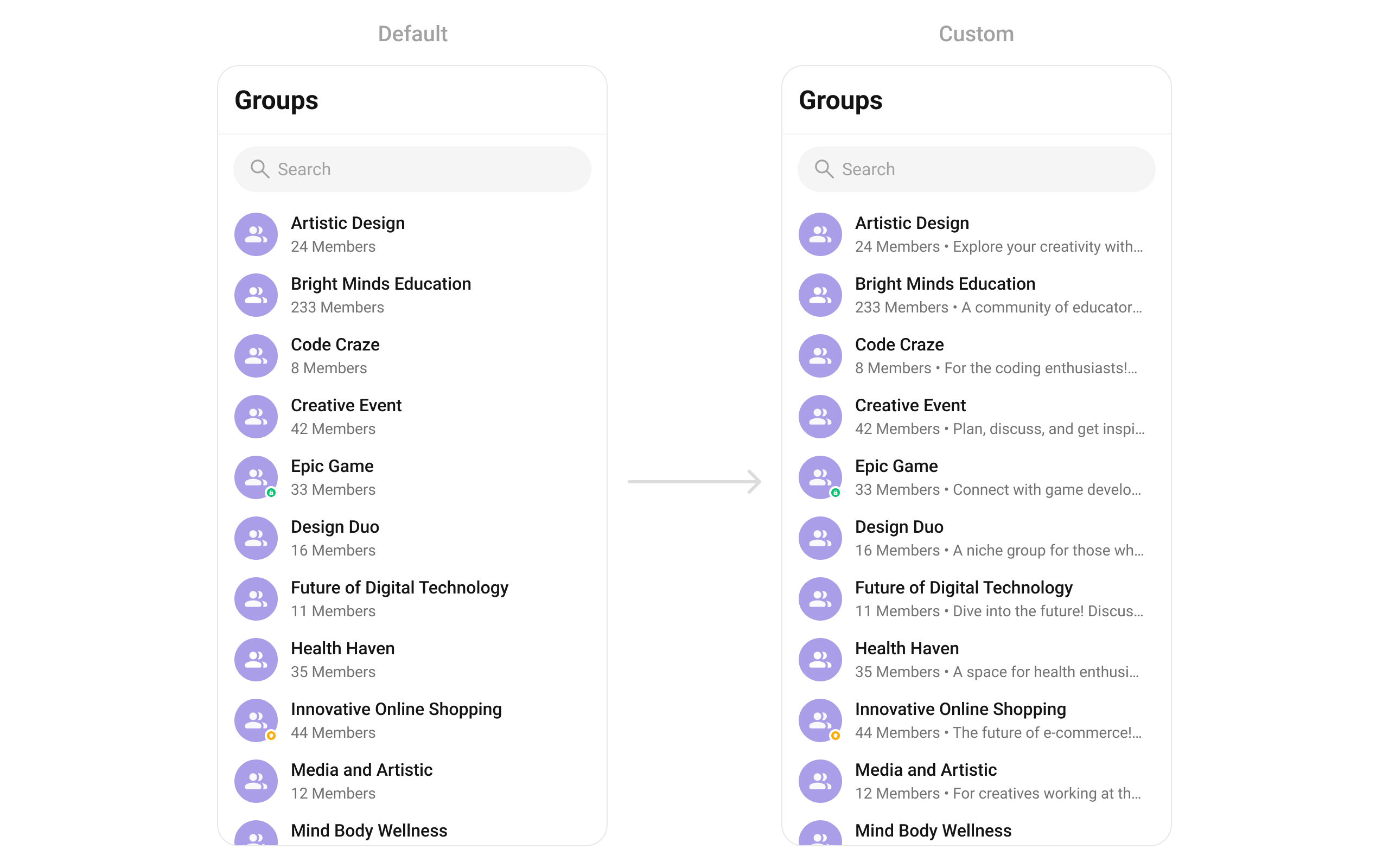
- Dart
trailingView
Replace the right section. Join status button example.- Dart
setOptions
Replace the context menu / long-press actions on each group item.- Dart
addOptions
Add to the existing context menu actions without removing defaults.- Dart
appBarOptions
Add custom widgets to the app bar.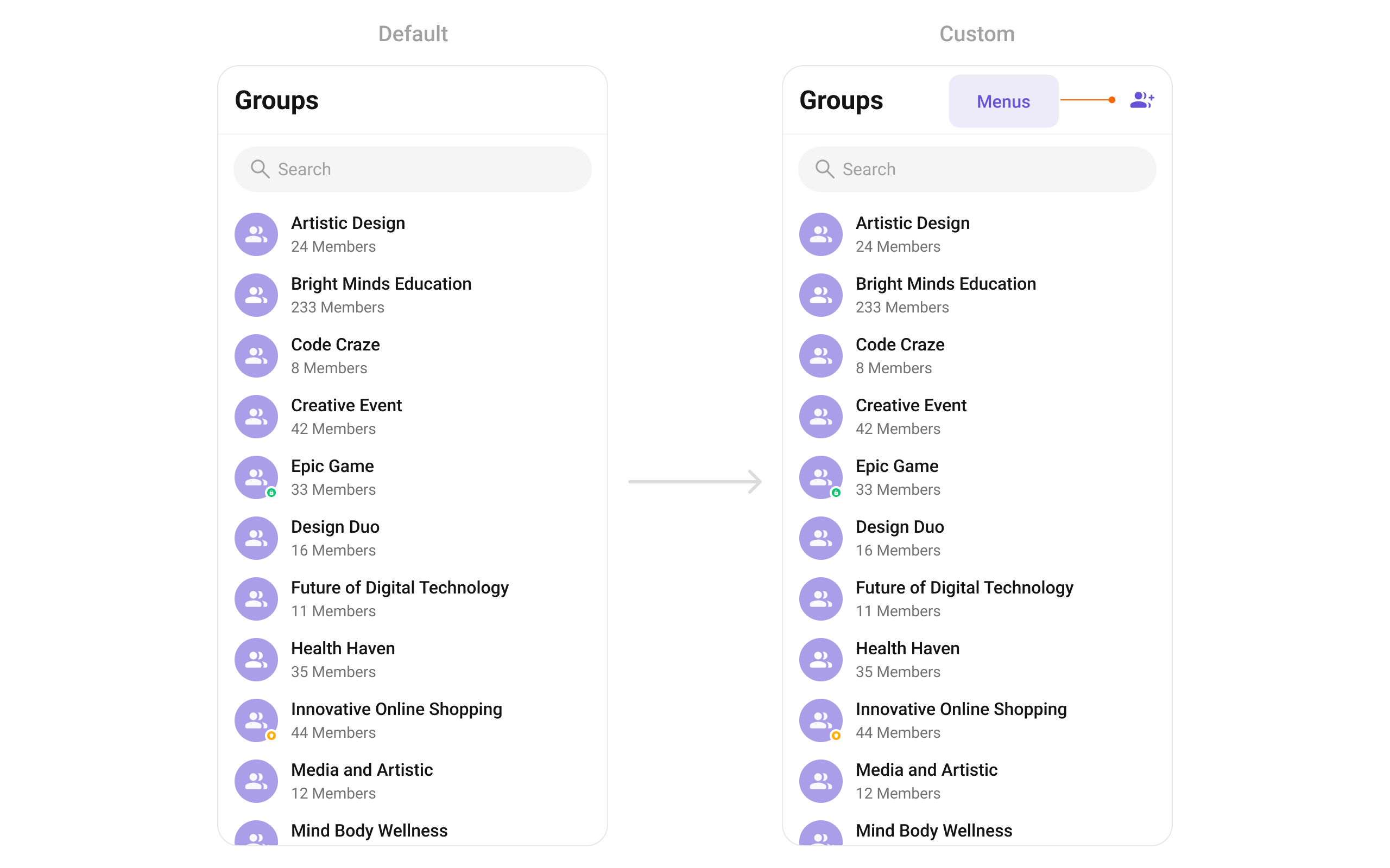
- Dart
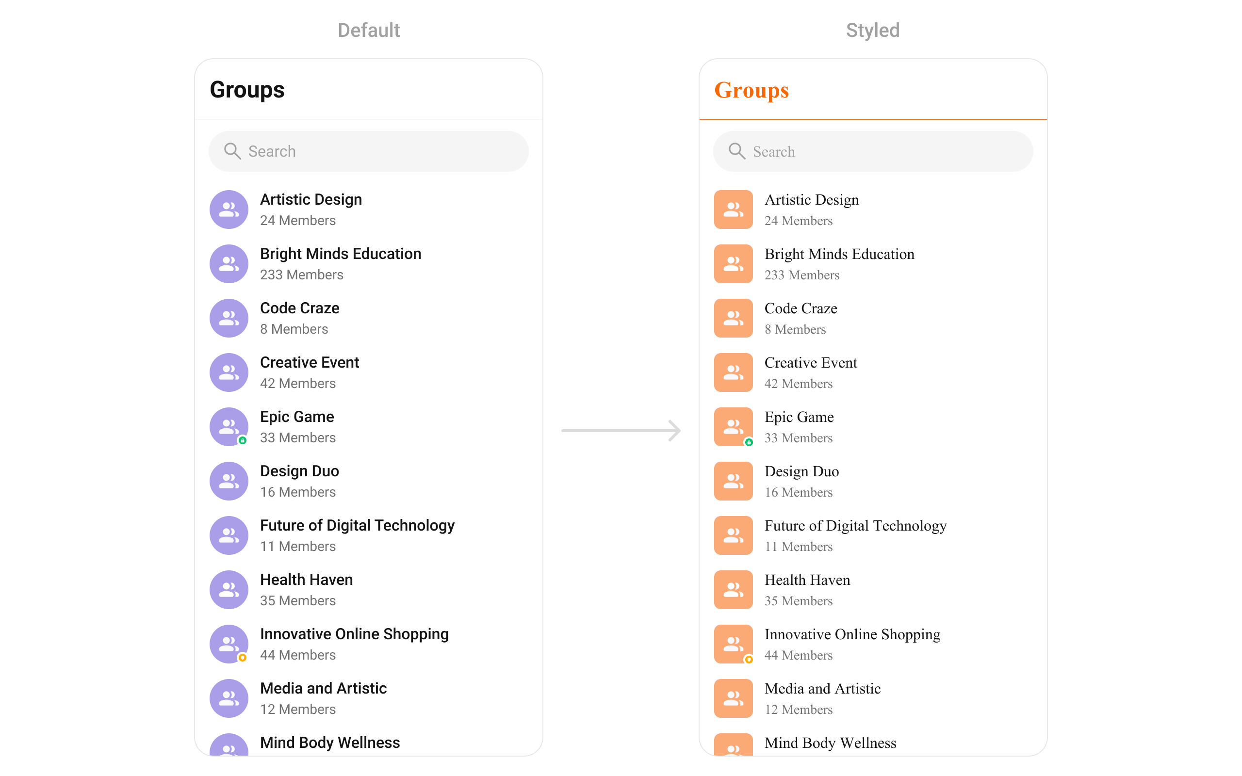
Styling
SetCometChatGroupsStyle to customize the appearance.
- Dart
Style Properties
| Property | Type | Description |
|---|---|---|
backgroundColor | Color | Background color of the component |
border | Border | Border for the widget |
borderRadius | BorderRadiusGeometry | Border radius for the widget |
titleTextColor | Color | Color of the header title |
titleTextStyle | TextStyle | Style for the header title |
backIconColor | Color | Back button icon color |
searchBackgroundColor | Color | Background color of search box |
searchBorder | BorderSide | Border for search box |
searchBorderRadius | BorderRadius | Border radius for search box |
searchPlaceHolderTextColor | Color | Placeholder text color in search |
searchPlaceHolderTextStyle | TextStyle | Placeholder text style in search |
searchIconColor | Color | Search icon color |
searchInputTextColor | Color | Search input text color |
searchInputTextStyle | TextStyle | Search input text style |
separatorColor | Color | Color of list item separators |
separatorHeight | double | Height of list item separators |
itemTitleTextColor | Color | Color of group name in list items |
itemTitleTextStyle | TextStyle | Style for group name in list items |
itemSubtitleTextColor | Color | Color of member count subtitle |
itemSubtitleTextStyle | TextStyle | Style for member count subtitle |
listItemSelectedBackgroundColor | Color | Background color for selected items |
privateGroupIconBackground | Color | Background color for private group icon |
protectedGroupIconBackground | Color | Background color for password group icon |
emptyStateTextColor | Color | Text color for empty state title |
emptyStateTextStyle | TextStyle | Text style for empty state title |
emptyStateSubTitleTextColor | Color | Text color for empty state subtitle |
emptyStateSubTitleTextStyle | TextStyle | Text style for empty state subtitle |
errorStateTextColor | Color | Text color for error state title |
errorStateTextStyle | TextStyle | Text style for error state title |
errorStateSubTitleTextColor | Color | Text color for error state subtitle |
errorStateSubTitleTextStyle | TextStyle | Text style for error state subtitle |
retryButtonBackgroundColor | Color | Background color for retry button |
retryButtonBorderRadius | BorderRadius | Border radius for retry button |
retryButtonBorder | BorderSide | Border for retry button |
retryButtonTextColor | Color | Text color for retry button |
retryButtonTextStyle | TextStyle | Text style for retry button |
submitIconColor | Color | Color of submit icon in selection mode |
checkBoxBackgroundColor | Color | Background color of unchecked checkbox |
checkBoxCheckedBackgroundColor | Color | Background color of checked checkbox |
checkboxSelectedIconColor | Color | Color of checkmark icon |
checkBoxBorderRadius | BorderRadius | Border radius for checkbox |
checkBoxBorder | BorderSide | Border for checkbox |
avatarStyle | CometChatAvatarStyle | Style for group avatars |
statusIndicatorStyle | CometChatStatusIndicatorStyle | Style for group type indicators |
Common Patterns
Custom empty state with CTA
- Dart
Joined groups only
- Dart
Multi-select with selection callback
- Dart
Hide all chrome — minimal list
- Dart
Accessibility
The component renders a scrollable list of interactive items. Each group row supports:- Tap gesture for selection/navigation
- Long-press gesture for context menu actions
- Checkbox selection in multi-select mode with proper touch targets
- Group type indicators (public/private/password) with visual icons
- Group names are readable as list item titles
- Group type indicators use icons — consider adding
Semanticswidgets vialeadingViewif screen reader descriptions are needed - Selection state is communicated through checkbox widgets
Props
All props are optional unless noted.activateSelection
Controls when selection mode activates.| Type | ActivateSelection |
| Default | null |
ActivateSelection.onClick, ActivateSelection.onLongClick
addOptions
Adds additional context menu actions to the default options.| Type | List<CometChatOption>? Function(Group, CometChatGroupsController, BuildContext) |
| Default | null |
appBarOptions
Custom widgets to display in the app bar.| Type | List<Widget> Function(BuildContext context) |
| Default | null |
backButton
Custom back button widget.| Type | Widget |
| Default | Built-in back arrow |
controllerTag
Identifier tag for controller management.| Type | String |
| Default | null |
emptyStateView
Custom view displayed when there are no groups.| Type | WidgetBuilder |
| Default | Built-in empty state |
errorStateView
Custom view displayed when an error occurs.| Type | WidgetBuilder |
| Default | Built-in error state |
groupsProtocol
Custom protocol for fetching groups.| Type | GroupsBuilderProtocol |
| Default | null |
groupsRequestBuilder
Controls which groups load and in what order.| Type | GroupsRequestBuilder |
| Default | SDK default (30 per page) |
.build().
groupsStyle
Styling options for the groups list.| Type | CometChatGroupsStyle |
| Default | null |
groupTypeVisibility
Shows or hides the group type icon (public/private/password) on group avatars.| Type | bool |
| Default | true |
height
Height of the widget.| Type | double |
| Default | null |
hideAppbar
Hides the app bar including title and search.| Type | bool |
| Default | false |
hideError
Hides the error state view.| Type | bool |
| Default | false |
hideSearch
Hides the search input box.| Type | bool |
| Default | false |
leadingView
Custom renderer for the avatar / left section.| Type | Widget? Function(BuildContext context, Group group) |
| Default | Built-in avatar |
listItemView
Custom renderer for the entire list item row.| Type | Widget Function(Group group) |
| Default | Built-in list item |
loadingStateView
Custom view displayed during loading state.| Type | WidgetBuilder |
| Default | Built-in shimmer |
onBack
Callback triggered when the back button is pressed.| Type | VoidCallback |
| Default | null |
onEmpty
Callback triggered when the group list is empty.| Type | OnEmpty |
| Default | null |
onError
Callback triggered when an error occurs.| Type | OnError |
| Default | null |
onItemLongPress
Callback triggered on long press of a group item.| Type | Function(BuildContext context, Group group) |
| Default | null |
onItemTap
Callback triggered when tapping a group item.| Type | Function(BuildContext context, Group group) |
| Default | null |
onLoad
Callback triggered when the list is successfully loaded.| Type | OnLoad<Group> |
| Default | null |
onSelection
Callback triggered when groups are selected. RequiresselectionMode to be set.
| Type | Function(List<Group>? list) |
| Default | null |
passwordGroupIcon
Custom icon widget for password-protected groups.| Type | Widget |
| Default | Built-in lock icon |
privateGroupIcon
Custom icon widget for private groups.| Type | Widget |
| Default | Built-in shield icon |
scrollController
Controller for scrolling the list.| Type | ScrollController |
| Default | null |
searchBoxIcon
Custom search box icon widget.| Type | Widget |
| Default | Built-in search icon |
searchKeyword
Pre-fills the search and filters the group list.| Type | String |
| Default | null |
searchPlaceholder
Placeholder text for the search input box.| Type | String |
| Default | null |
selectionMode
Enables single or multi-select mode.| Type | SelectionMode |
| Default | null |
SelectionMode.single, SelectionMode.multiple, SelectionMode.none
setOptions
Replaces the default context menu actions.| Type | List<CometChatOption>? Function(Group, CometChatGroupsController, BuildContext) |
| Default | null |
showBackButton
Shows or hides the back button.| Type | bool |
| Default | true |
stateCallBack
Callback to access controller functions from parent.| Type | Function(CometChatGroupsController controller) |
| Default | null |
submitIcon
Custom submit icon widget for selection mode.| Type | Widget |
| Default | Built-in check icon |
subtitleView
Custom renderer for the member count subtitle.| Type | Widget? Function(BuildContext context, Group group) |
| Default | Built-in member count |
title
Title text displayed in the app bar.| Type | String |
| Default | "Groups" |
titleView
Custom renderer for the name / title text.| Type | Widget? Function(BuildContext context, Group group) |
| Default | Built-in title |
trailingView
Custom renderer for the right section.| Type | Widget? Function(BuildContext context, Group group) |
| Default | null |
width
Width of the widget.| Type | double |
| Default | null |
Events
CometChatGroups subscribes to CometChatGroupEvents:
| Event | Payload | Internal behavior |
|---|---|---|
ccGroupCreated | Group | Adds new group to list |
ccGroupDeleted | Group | Removes group from list |
ccGroupLeft | Action, User, Group | Removes private group or updates hasJoined |
ccGroupMemberJoined | User, Group | Updates group in list |
ccGroupMemberAdded | List<Action>, List<User>, Group, User | Updates group in list |
ccGroupMemberKicked | Action, User, User, Group | Updates group in list |
ccGroupMemberBanned | Action, User, User, Group | Updates group in list |
ccOwnershipChanged | Group, GroupMember | Updates group in list |
Customization Matrix
| What to change | Where | Property/API | Example |
|---|---|---|---|
| Override behavior on group interaction | Component props | on<Event> callbacks | onItemTap: (ctx, group) => setActive(group) |
| Filter which groups appear | Component props | groupsRequestBuilder | groupsRequestBuilder: GroupsRequestBuilder()..joinedOnly = true |
| Toggle visibility of UI elements | Component props | hide<Feature> / show<Feature> boolean props | hideSearch: true |
| Replace a section of the list item | Component props | <slot>View render props | listItemView: (group) => CustomWidget() |
| Change colors, fonts, spacing | Component props | groupsStyle | groupsStyle: CometChatGroupsStyle(titleTextColor: Colors.red) |