AI Agent Component Spec
AI Agent Component Spec
Where It Fits
CometChatGroupMembers displays all members of a group with their roles (owner, admin, moderator, participant). It provides member management actions like kick, ban, and scope change. Wire it to CometChatGroups to show members when a group is selected.
- Dart
CometChatGroupMembers widget is composed of the following BaseWidgets:
| Widgets | Description |
|---|---|
| CometChatListBase | Container widget with title, search functionality, and background settings |
| CometChatListItem | Renders member information with title, subtitle, leading, and trailing widgets |
Minimal Render
- Dart
Navigator.push:
Filtering Group Members
Pass aGroupMembersRequestBuilder to groupMembersRequestBuilder. Pass the builder instance — not the result of .build().
- Dart
Filter Recipes
| Recipe | Code |
|---|---|
| Limit to 10 per page | GroupMembersRequestBuilder(guid)..limit = 10 |
| Search by keyword | GroupMembersRequestBuilder(guid)..searchKeyword = "john" |
| Filter by scopes | GroupMembersRequestBuilder(guid)..scopes = ["admin", "moderator"] |
GroupMembersRequestBuilder Properties
| Property | Description | Code |
|---|---|---|
guid | Group ID (required) | GroupMembersRequestBuilder("group_id") |
limit | Number of members to fetch per request | ..limit = 30 |
searchKeyword | Search members by name | ..searchKeyword = "John" |
scopes | Filter by member scopes | ..scopes = ["admin"] |
build() | Builds and returns a GroupMembersRequest object | .build() |
Custom Protocol Builder
UseGroupMembersBuilderProtocol to customize both the initial list and search results:
- Dart
Actions and Events
Callback Props
onItemTap
Fires when a member row is tapped. Use for showing member profile or custom actions.- Dart
onItemLongPress
Fires when a member row is long-pressed. Useful for showing context menus.- Dart
onSelection
Fires when members are selected in multi-select mode. RequiresselectionMode to be set.
- Dart
onError
Fires on internal errors (network failure, auth issue, SDK exception).- Dart
onBack
Fires when the back button is pressed.- Dart
onLoad
Fires when the member list is successfully loaded.- Dart
onEmpty
Fires when the member list is empty.- Dart
Global UI Events
CometChatGroupEvents emits events subscribable from anywhere in the application. Add a listener in initState and remove it in dispose.
| Event | Fires when | Payload |
|---|---|---|
ccGroupMemberScopeChanged | A member’s scope is changed | Action, User, String scopeChangedTo, String scopeChangedFrom, Group |
ccGroupMemberBanned | A member is banned | Action, User, User bannedBy, Group |
ccGroupMemberKicked | A member is kicked | Action, User, User kickedBy, Group |
- Dart
SDK Events (Real-Time, Automatic)
The component listens to these SDK events internally. No manual attachment needed unless additional side effects are required.| SDK Listener | Internal behavior |
|---|---|
onGroupMemberScopeChanged | Updates member scope badge |
onGroupMemberKicked | Removes member from list |
onGroupMemberLeft | Removes member from list |
onGroupMemberBanned | Removes member from list |
onGroupMemberJoined | Adds new member to list |
onMemberAddedToGroup | Adds new member to list |
onUserOnline | Updates online status indicator |
onUserOffline | Updates offline status indicator |
Custom View Slots
Each slot replaces a section of the default UI. Slots that accept a member parameter receive theGroupMember object for that row.
| Slot | Signature | Replaces |
|---|---|---|
listItemView | Widget Function(GroupMember) | Entire list item row |
leadingView | Widget? Function(BuildContext, GroupMember) | Avatar / left section |
titleView | Widget? Function(BuildContext, GroupMember) | Member name |
subtitleView | Widget? Function(BuildContext, GroupMember) | Secondary text |
trailingView | Function(BuildContext, GroupMember) | Scope badge / right section |
loadingStateView | WidgetBuilder | Loading spinner |
emptyStateView | WidgetBuilder | Empty state |
errorStateView | WidgetBuilder | Error state |
setOptions | List<CometChatOption>? Function(Group, GroupMember, Controller, BuildContext) | Context menu actions (replaces default) |
addOptions | List<CometChatOption>? Function(Group, GroupMember, Controller, BuildContext) | Context menu actions (adds to default) |
appBarOptions | List<Widget> | App bar action widgets |
listItemView
Replace the entire list item row.
- Dart
leadingView
Replace the avatar / left section. Online status indicator example.- Dart
titleView
Replace the member name. Role badge inline example.- Dart
subtitleView
Replace the secondary text. Join date example.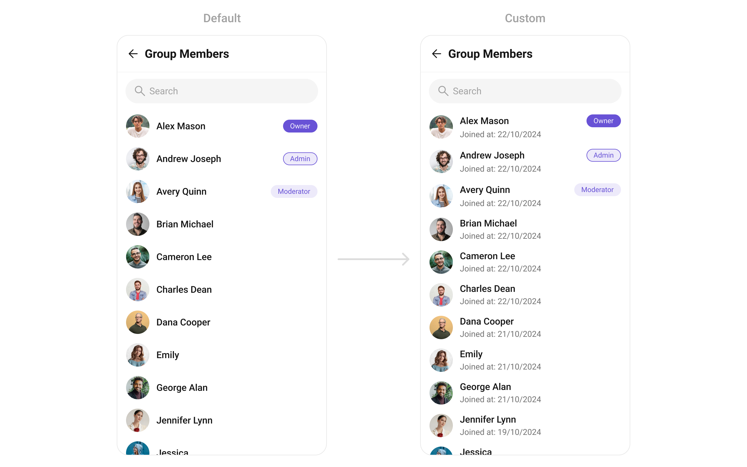
- Dart
trailingView
Replace the scope badge / right section. Custom scope badge example.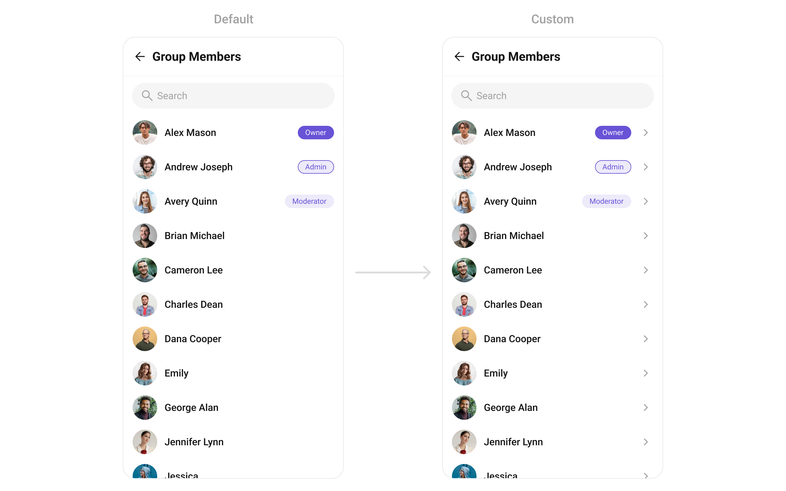
- Dart
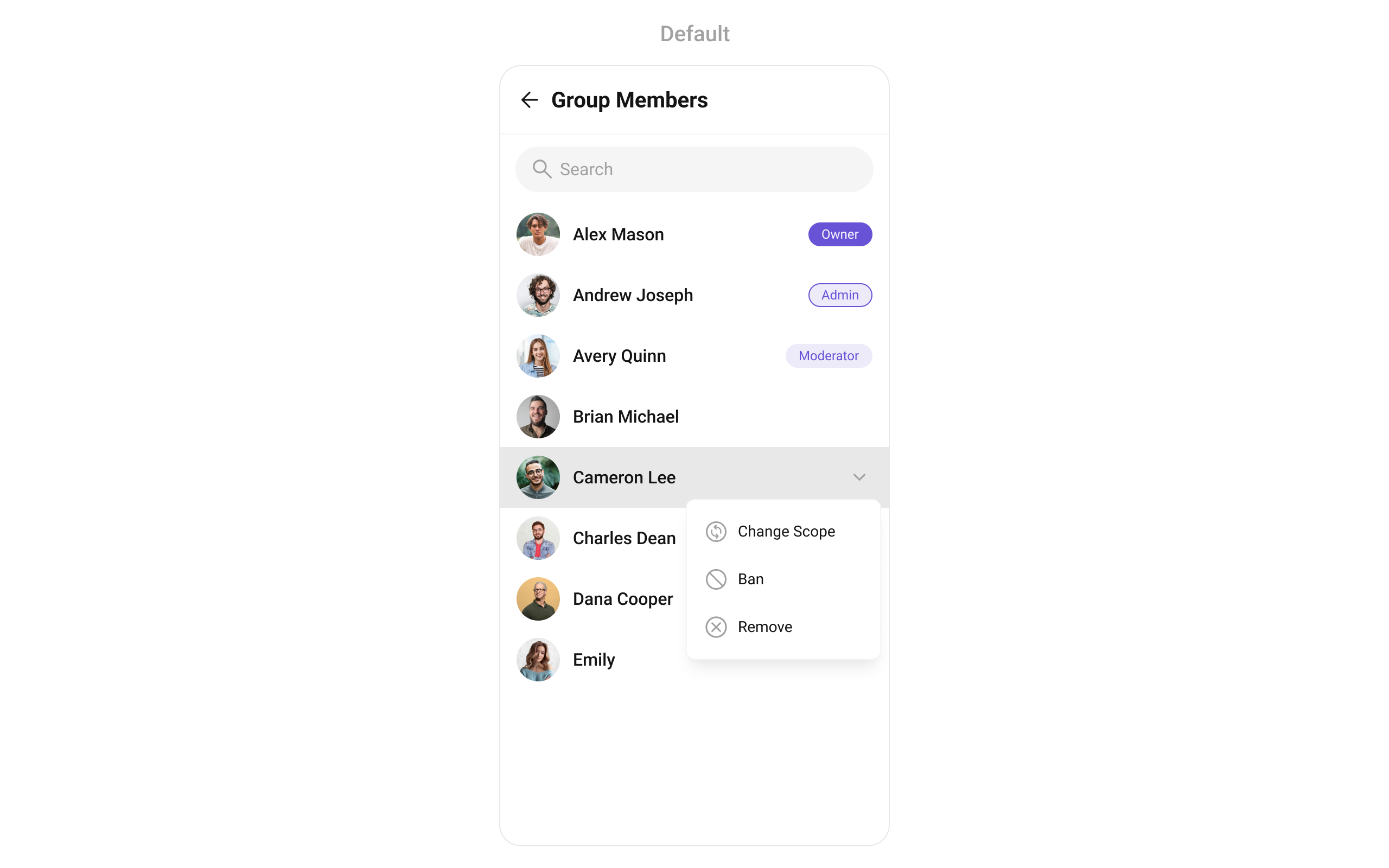
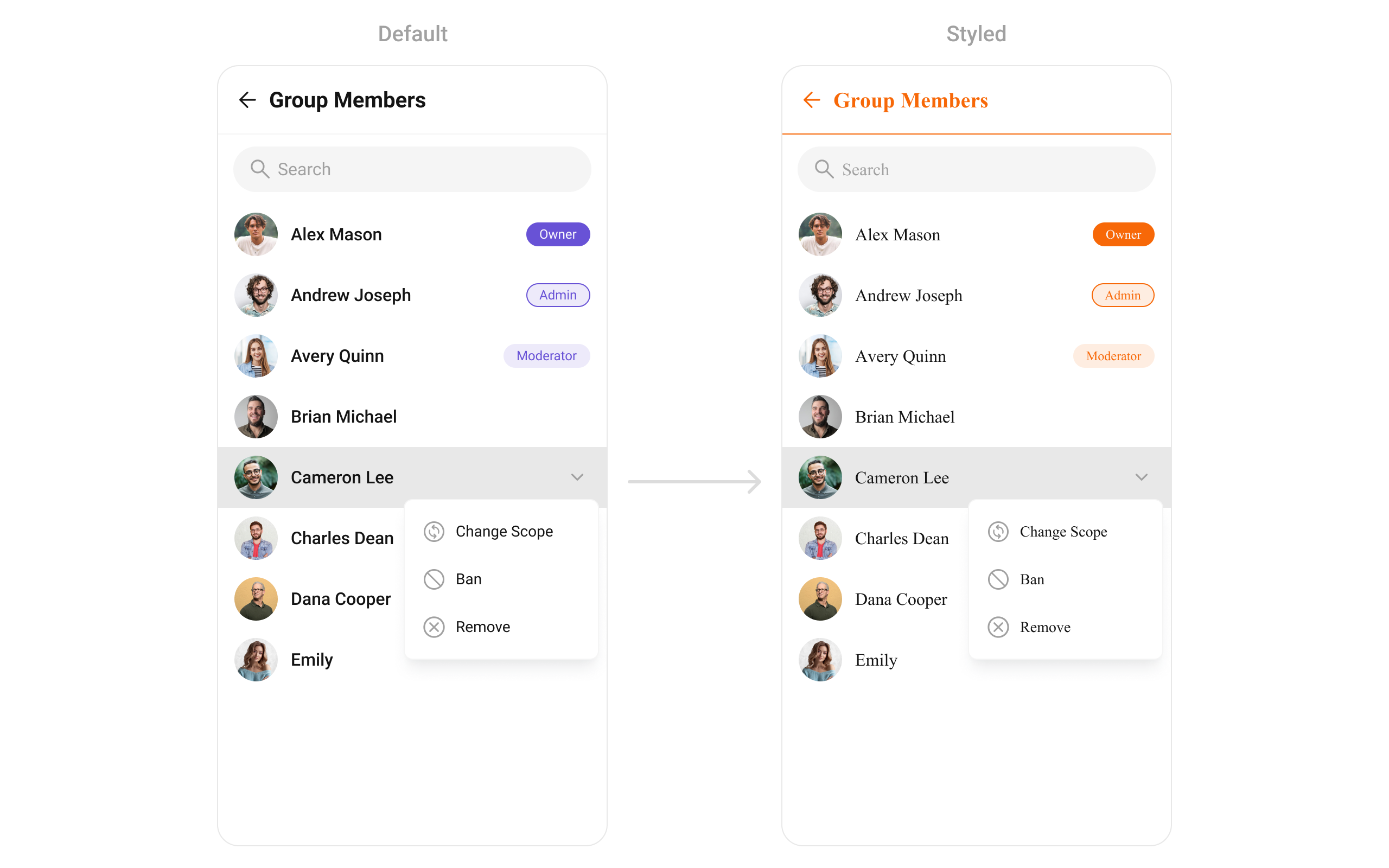
setOptions
Replace the context menu / long-press actions on each member item.- Dart
addOptions
Add to the existing context menu actions without removing defaults.- Dart
appBarOptions
Add custom widgets to the app bar.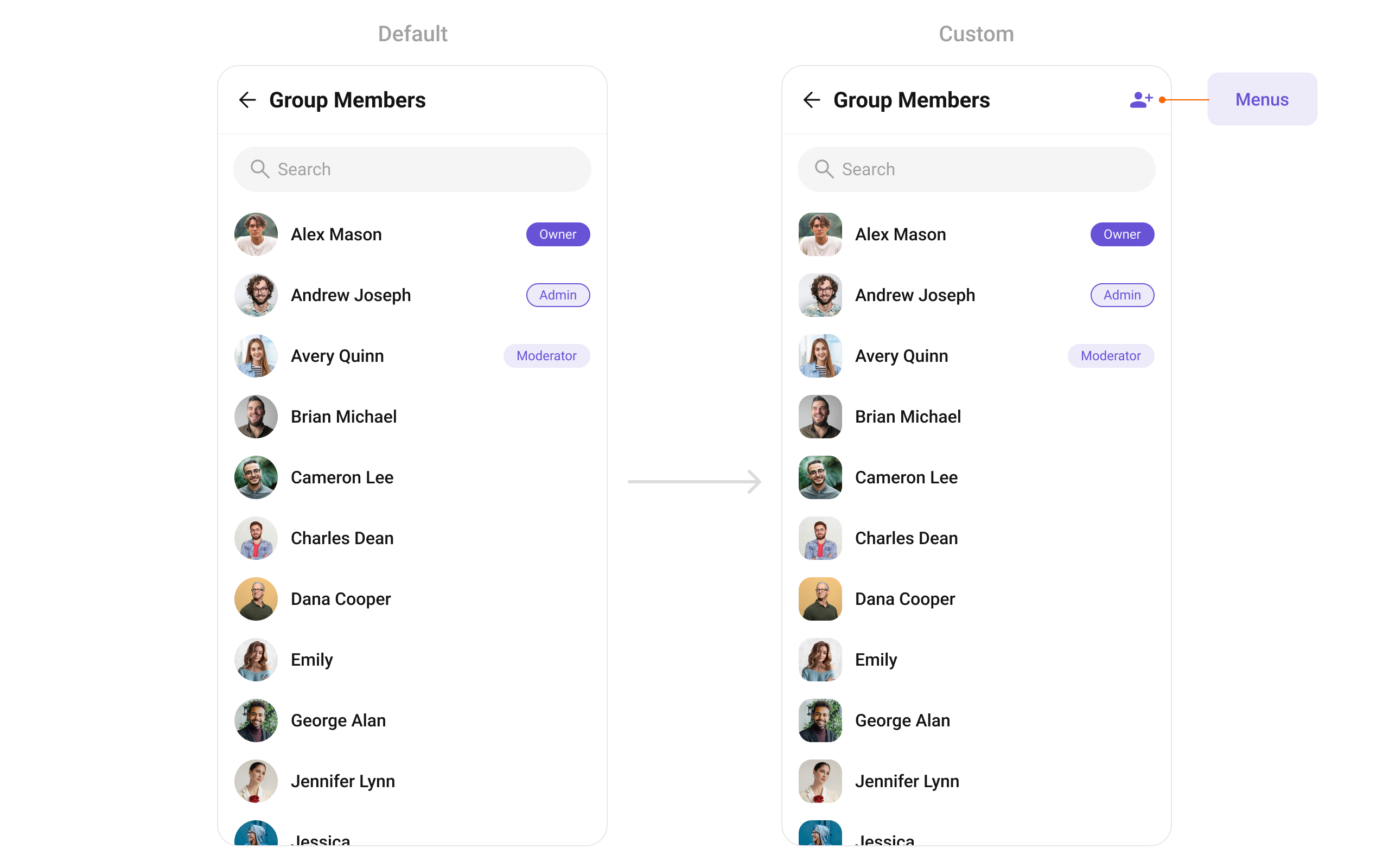
- Dart
loadingStateView
Custom view displayed while members are being fetched.- Dart
emptyStateView
Custom view displayed when no members are found.- Dart
errorStateView
Custom view displayed when an error occurs.- Dart
Styling
SetCometChatGroupMembersStyle to customize the appearance.
- Dart
Style Properties
| Property | Type | Description |
|---|---|---|
backgroundColor | Color? | Background color of the component |
border | BoxBorder? | Border for the widget |
borderRadius | BorderRadiusGeometry? | Border radius for the widget |
titleStyle | TextStyle? | Style for the header title |
backIconColor | Color? | Back button icon color |
searchBackground | Color? | Background color of search box |
searchBorderRadius | BorderRadius? | Border radius for search box |
searchTextStyle | TextStyle? | Style for search input text |
searchPlaceholderStyle | TextStyle? | Style for search placeholder |
searchIconColor | Color? | Search icon color |
loadingIconColor | Color? | Loading indicator color |
emptyStateTextStyle | TextStyle? | Style for empty state title |
emptyStateTextColor | Color? | Color for empty state title text |
emptyStateSubtitleTextStyle | TextStyle? | Style for empty state subtitle |
emptyStateSubtitleTextColor | Color? | Color for empty state subtitle text |
errorStateTextStyle | TextStyle? | Style for error state title |
errorStateSubtitleStyle | TextStyle? | Style for error state subtitle |
onlineStatusColor | Color? | Online status indicator color |
separatorColor | Color? | Color of list item separators |
separatorHeight | double? | Height of list item separators |
listPadding | EdgeInsetsGeometry? | Padding for the list |
ownerMemberScopeBackgroundColor | Color? | Background color for owner scope badge |
ownerMemberScopeTextColor | Color? | Text color for owner scope badge |
ownerMemberScopeBorder | BoxBorder? | Border for owner scope badge |
ownerMemberScopeTextStyle | TextStyle? | Text style for owner scope badge |
adminMemberScopeBackgroundColor | Color? | Background color for admin scope badge |
adminMemberScopeTextColor | Color? | Text color for admin scope badge |
adminMemberScopeBorder | BoxBorder? | Border for admin scope badge |
adminMemberScopeTextStyle | TextStyle? | Text style for admin scope badge |
moderatorMemberScopeBackgroundColor | Color? | Background color for moderator scope badge |
moderatorMemberScopeTextColor | Color? | Text color for moderator scope badge |
moderatorMemberScopeBorder | BoxBorder? | Border for moderator scope badge |
moderatorMemberScopeTextStyle | TextStyle? | Text style for moderator scope badge |
checkboxCheckedBackgroundColor | Color? | Background color for checked checkbox |
checkboxBackgroundColor | Color? | Background color for unchecked checkbox |
checkboxSelectedIconColor | Color? | Color for checkbox icon when selected |
checkboxBorder | BorderSide? | Border for checkbox |
checkboxBorderRadius | BorderRadiusGeometry? | Border radius for checkbox |
listItemSelectedBackgroundColor | Color? | Background color for selected list item |
submitIconColor | Color? | Color for submit icon |
retryButtonBackgroundColor | Color? | Background color for retry button |
retryButtonTextColor | Color? | Text color for retry button |
retryButtonTextStyle | TextStyle? | Text style for retry button |
retryButtonBorder | BorderSide? | Border for retry button |
retryButtonBorderRadius | BorderRadiusGeometry? | Border radius for retry button |
avatarStyle | CometChatAvatarStyle? | Style for member avatars |
statusIndicatorStyle | CometChatStatusIndicatorStyle? | Style for status indicators |
listItemStyle | ListItemStyle? | Style for list items |
confirmDialogStyle | CometChatConfirmDialogStyle? | Style for confirmation dialogs |
changeScopeStyle | CometChatChangeScopeStyle? | Style for change scope dialog |
optionsBackgroundColor | Color? | Background color for options menu |
optionsIconColor | Color? | Color for options icon |
optionsTextStyle | TextStyle? | Text style for options |
Common Patterns
Hide member management options
- Dart
Multi-select with selection callback
- Dart
Hide all chrome — minimal list
- Dart
Filter admins and moderators only
- Dart
Props Reference
| Prop | Type | Default | Description |
|---|---|---|---|
group | Group | required | The group object to fetch members from |
groupMembersProtocol | GroupMembersBuilderProtocol? | null | Custom request builder protocol |
groupMembersRequestBuilder | GroupMembersRequestBuilder? | null | Custom request builder for filtering members |
searchKeyword | String? | null | Pre-fills search and filters list |
controllerTag | String? | null | Tag for controller management |
onSelection | Function(List<GroupMember>?)? | null | Callback when members are selected |
onItemTap | Function(GroupMember)? | null | Callback on tapping a member item |
onItemLongPress | Function(GroupMember)? | null | Callback on long pressing a member item |
onBack | VoidCallback? | null | Callback on closing this screen |
onError | OnError? | null | Callback in case any error occurs |
onLoad | OnLoad<GroupMember>? | null | Callback when list is fetched and loaded |
onEmpty | OnEmpty? | null | Callback when the list is empty |
stateCallBack | Function(CometChatGroupMembersController)? | null | Access controller functions from parent |
showBackButton | bool | true | Show/hide back button |
hideSearch | bool | false | Show/hide search input |
hideSeparator | bool? | null | Toggle visibility of separator |
hideError | bool? | null | Toggle visibility of error dialog |
hideAppbar | bool? | null | Hides the appbar |
usersStatusVisibility | bool? | true | Hide status indicator on avatar |
hideKickMemberOption | bool? | null | Hide kick member option |
hideBanMemberOption | bool? | null | Hide ban member option |
hideScopeChangeOption | bool? | null | Hide scope change option |
selectionMode | SelectionMode? | null | Selection mode (single/multiple/none) |
activateSelection | ActivateSelection? | null | When to activate selection |
subtitleView | Widget? Function(BuildContext, GroupMember)? | null | Custom subtitle for each member |
listItemView | Widget Function(GroupMember)? | null | Custom view for each member |
trailingView | Function(BuildContext, GroupMember)? | null | Custom trailing widget |
leadingView | Widget? Function(BuildContext, GroupMember)? | null | Custom leading view |
titleView | Widget? Function(BuildContext, GroupMember)? | null | Custom title view |
loadingStateView | WidgetBuilder? | null | View for loading state |
emptyStateView | WidgetBuilder? | null | View for empty state |
errorStateView | WidgetBuilder? | null | View for error state |
backButton | Widget? | null | Custom back button widget |
searchBoxIcon | Widget? | null | Custom search icon |
selectIcon | Widget? | null | Custom selection icon |
submitIcon | Widget? | null | Custom selection complete icon |
appBarOptions | List<Widget>? | null | App bar options |
options | List<CometChatOption>? Function(...)? | null | Options visible at slide of each member |
setOptions | List<CometChatOption>? Function(...)? | null | Replace default long press actions |
addOptions | List<CometChatOption>? Function(...)? | null | Add to default long press actions |
searchPlaceholder | String? | null | Placeholder text of search input |
height | double? | null | Height of the widget |
width | double? | null | Width of the widget |
style | CometChatGroupMembersStyle? | null | Style for the component |
controller | ScrollController? | null | Scroll controller for the list |